
The difference between a successful conversion and a missed opportunity often hinges on the strength of your landing page copy. The key lies not just in outlining what you offer but in compellingly conveying why it matters to your audience.
Crafting copy that achieves this balance requires a nuanced approach.
You would need to blend time-honored techniques with innovative strategies to truly resonate with and convert your audience. It’s essential to merge the reliability of proven methods with the allure of creative, unexpected elements.
This fusion ensures your message not only reaches its target but also captivates, persuades, and ultimately converts, setting the foundation for a robust digital presence.
Landing pages are specialized web pages designed with a single focus or goal, known as a call to action (CTA), aimed at converting visitors into leads or customers.
Unlike general web pages, which may serve various purposes, landing pages direct visitors towards taking a specific action, such as signing up for a newsletter, registering for a webinar, or making a purchase. This targeted approach is what makes landing pages an invaluable tool in digital marketing strategies.
They work by presenting a streamlined path that guides visitors from initial interest to conversion, minimizing distractions and honing in on the benefits of a product or service. Effective landing pages use persuasive copy, compelling design, and psychological triggers to build interest and trust, making it clear why the visitor should take the desired action.
By focusing on solving a specific problem or fulfilling a need, landing pages enhance the user experience and significantly increase the likelihood of converting casual browsers into committed customers.
In the realm of digital marketing, developing resultful landing pages requires a blend of proven methodologies and innovative, unusual ideas—a principle at the heart of my “Unusual By Strategy” forte. This unique approach leverages the strength of traditional techniques, such as clear calls to action, compelling headlines, and persuasive content, while integrating unconventional strategies that disrupt standard patterns and grab attention.
For instance, incorporating interactive elements like quizzes or augmented reality experiences can transform passive viewing into active engagement, enhancing the user’s connection with the brand. Similarly, using storytelling or gamification elements not only differentiates the landing page from competitors but also creates memorable experiences that encourage sharing and return visits.
This dual-strategy approach ensures that landing pages not only meet the baseline requirements for conversion but exceed them by delivering unexpected value and novelty that captivates and converts audiences more effectively.
By marrying the reliability of proven methods with the allure of creative innovation, landing pages become powerful tools that stand out in a crowded digital landscape.
Leveraging my 40+ years’ experience as a Brand Content Strategist with a penchant for the unusual, I’ve crafted eight ideas that blend time-tested approaches with innovative twists for writing landing page copy that converts. These ideas marry the conventional—like clear, compelling headlines and persuasive calls to action—with creative, offbeat strategies, such as interactive storytelling or immersive visual elements, to captivate and engage.
By incorporating unexpected interactive content or leveraging psychological triggers in novel ways, these strategies are designed to not only draw attention but also deepen engagement and enhance conversion rates, making your landing pages not just functional, but unforgettable.
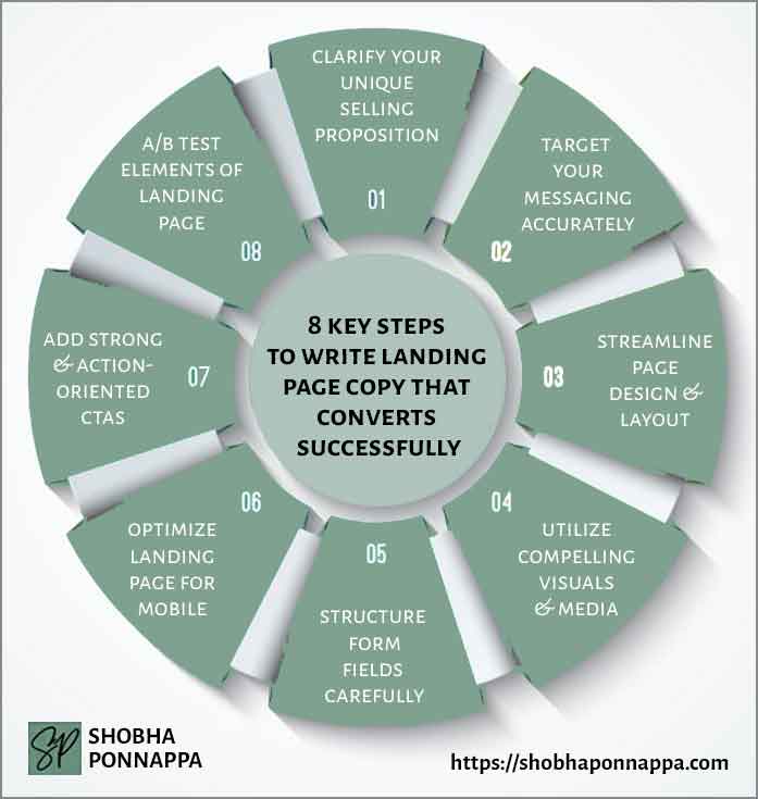
Identifying and clearly communicating your unique selling proposition (USP) is paramount when crafting landing page copy that converts. This foundational strategy ensures that when visitors land on your page, they instantly grasp what sets your offering apart from the competition.
Imagine a landing page for an eco-friendly water bottle brand; its USP might highlight an innovative, self-filtering design that not only promises purity with every sip but also contributes to reducing plastic waste, directly appealing to environmentally conscious consumers.
By embedding this USP within your landing page copy, you align your product’s distinct advantages with the specific needs and values of your target audience, thereby elevating the persuasiveness of your content. This alignment is crucial in content marketing, where the goal is not just to inform but to resonate on a personal level, encouraging visitors to take action.
Effectively communicated, your USP can transform your landing page from a mere digital brochure into a compelling narrative that demonstrates exactly why your product or service is the solution your audience has been searching for.

Consider the idea of “Sensory Integration.” This unusual enhancement involves weaving sensory experiences into your unique selling proposition to create a more vivid, memorable connection with your audience. By incorporating elements that appeal to the senses—such as visual imagery, sound, or even tactile suggestions—you can elevate the emotional impact of your USP.
For the eco-friendly water bottle example, instead of merely stating its self-filtering feature and environmental benefits, evoke the feeling of crisp, refreshing water in every sip, accompanied by visuals of water droplets on green leaves and the sound of a stream in the background. This sensory-rich presentation not only clarifies the USP but also deeply embeds it in the visitor’s mind, making the proposition—and the landing page—unforgettable.
Achieving precision in your messaging is crucial for crafting landing page copy that resonates with your intended audience and drives conversions. By deeply understanding your audience’s demographics, interests, and pain points, you can tailor your message to speak directly to their needs and desires.
For instance, if you’re promoting a cutting-edge fitness app designed for busy professionals, your messaging should highlight how the app fits seamlessly into hectic schedules, offering quick, effective workouts that can be done anywhere, anytime.
This targeted approach ensures that your content marketing efforts are not just casting a wide net but are strategically aimed at those most likely to benefit from your offering.
By aligning your message with the specific aspirations and challenges of your audience, you increase the relevance and appeal of your landing page, making it a powerful tool in converting visitors into engaged customers.
Consider the idea of “Emotional Analytics.” This unusual enhancement involves using advanced data analytics to understand the emotional triggers of your target audience, going beyond traditional demographics or interests. By analyzing social media behavior, feedback, and interaction patterns, you can gain insights into the emotional states that drive your audience’s decisions.
Applying this to the fitness app for busy professionals, you would craft messaging that not only highlights the app’s convenience and efficiency but also taps into feelings of empowerment, achievement, and the emotional relief from stress. This approach ensures your messaging not only targets your audience with accuracy but also resonates on a deeper emotional level, significantly boosting conversion potential.
Streamlining your page design and layout is fundamental to enhancing user experience and maximizing conversion rates on landing pages. A clutter-free, intuitive design ensures that visitors can easily navigate the page and find the information they need without being overwhelmed.
For example, a landing page for a new software tool aimed at small business owners might feature a clean layout with a prominent headline, a brief but powerful description of the tool’s benefits, followed by a clear call to action.
Visuals would be used sparingly but effectively, to demonstrate the software’s interface or highlight key functionalities, ensuring they support the copy rather than distract from it. This strategic simplification of design elements directs the visitor’s attention to the most important information, making the decision-making process smoother and leading them more naturally toward conversion.
In content marketing, where capturing and retaining audience attention is crucial, such streamlined designs play a pivotal role in converting interest into action.
Consider the idea of “Dynamic Contextual Layouts.” This unusual enhancement involves designing your landing page to adapt its layout and content presentation based on the visitor’s behavior or demographic data. By employing machine learning algorithms, the page can dynamically rearrange itself to prioritize information or visuals that are most likely to appeal to the individual’s interests or past interactions.
For instance, if the software tool aimed at small business owners detects a visitor from the retail industry, it could automatically highlight features and testimonials specific to retail, making the page instantly more relevant and engaging. This approach not only streamlines the design for each user but also significantly enhances personalization, driving higher conversion rates by directly addressing the visitor’s unique needs and preferences.
Incorporating compelling visuals and media into landing pages is a powerful strategy to capture attention, convey information quickly, and evoke emotional responses that drive conversions.
High-quality images, videos, and infographics can break up text-heavy content, making the page more engaging and easier to digest. For example, a landing page for an adventure travel company could feature breathtaking video footage of exotic destinations, immersive 360-degree tours, and vibrant photo galleries that transport visitors to the heart of the experience.
These visuals serve not only to beautify the page but also to illustrate the unique experiences the company offers, helping potential travelers envision themselves embarking on the journey.
In content marketing, where storytelling plays a crucial role in connecting with audiences, the strategic use of visuals and media enriches the narrative, making the value proposition more tangible and compelling, thereby increasing the likelihood of converting visitors into bookings.
Consider the idea of “Interactive Storytelling Elements.” This unusual enhancement involves integrating interactive visuals and media that not only display content but also invite the audience to engage directly with the story. By embedding elements such as clickable hotspots in images that reveal more information, drag-and-drop features to explore product benefits, or short, interactive scenarios that simulate product experiences, you transform passive viewers into active participants.
For the adventure travel company example, imagine a virtual tour where users can choose their path through a scenic landscape, unlocking stories, facts, and videos along the way. This immersive approach not only captivates the audience’s attention but also deepens their connection to the experiences offered, making the proposition far more compelling and memorable, thereby enhancing the conversion potential of the landing page.
Paying attention to structuring form fields on landing pages is critical for minimizing friction and maximizing conversions. A well-designed form asks for only the most essential information, using as few fields as possible to reduce user effort and increase completion rates.
For example, a landing page designed for a financial consulting service aiming to generate leads might feature a form that requires just a name, email, and a dropdown to select the service of interest. This streamlined approach respects the user’s time and reduces the cognitive load, making it more likely for visitors to submit their details.
Additionally, placing the form prominently on the page, with a clear and compelling call to action, directly ties into content marketing strategies by ensuring the content’s effectiveness is measurable through lead generation metrics.
Thoughtfully structured forms enhance the user experience, directly contributing to a landing page’s ability to convert interested visitors into leads and customers, thereby closing the loop between content engagement and conversion actions.
Consider the idea of “Adaptive Field Logic.” This unusual enhancement involves designing forms that dynamically adapt based on the user’s input, providing a more personalized and engaging interaction. For instance, if a user selects a specific service of interest in the initial dropdown of a financial consulting service’s form, the subsequent fields could automatically adjust to gather more relevant details about that particular service need.
This means if someone indicates interest in retirement planning, the form might then ask about their retirement goals and current savings, making the form feel more tailored and less generic. Adaptive Field Logic not only streamlines the form-filling process by making it more relevant to the user’s specific situation but also gathers more targeted information for the service provider, enhancing the quality of leads generated from the landing page.
Optimizing your landing page for mobile is essential, as a significant portion of web traffic now comes from mobile devices. This means ensuring your landing page loads quickly, is easy to navigate on a small screen, and that all elements are touch-friendly.
For example, a boutique online store launching a new product line could see improved conversion rates by implementing responsive design that adjusts the layout automatically for mobile users, using large, easy-to-tap buttons for its call to action, and ensuring images are optimized for fast loading even on slower mobile connections.
This mobile-first approach not only enhances the user experience for the growing number of smartphone users but also supports content marketing efforts by making content accessible and engaging across all devices.
By prioritizing mobile optimization, brands can effectively reach and convert a wider audience, leveraging the convenience and immediacy of mobile browsing to drive action.
Consider the idea of “Context-Aware Interactivity.” This unusual enhancement involves creating mobile landing pages that adapt not just in layout but also in content and interactivity based on the user’s current context—such as their location, the time of day, or even the weather. For the boutique online store example, if a visitor accesses the landing page for a new line of winter clothing on a cold day, the page could dynamically highlight products suited for chilly weather, offer a time-sensitive discount to encourage immediate action, and display customer reviews praising the warmth and comfort of the clothes.
This level of personalization enhances the mobile experience by making it feel uniquely tailored to the user’s immediate situation and needs, significantly increasing the likelihood of conversion by presenting the most relevant and compelling content at the perfect time.
Incorporating strong and action-oriented CTAs (Call to Actions) is a cornerstone of effective landing page design, directly influencing the page’s conversion rate. A compelling CTA not only instructs visitors on what to do next but also motivates them to take that action immediately.
Imagine a landing page for an online course on digital marketing. Rather than a generic “Click Here,” the CTA button says “Start Mastering Digital Marketing Today!”
This specific, action-oriented language paired with a sense of urgency encourages users to act now, leveraging the psychological trigger of immediate reward. The CTA is designed to stand out with a contrasting color and is placed both above the fold for quick visibility and again after compelling content that outlines the benefits and unique value of the course.
This strategic repetition ensures that the call to action is always within easy reach, guiding users towards conversion with clear, persuasive instructions that are integral to the success of content marketing efforts.
Consider the idea of “Gamified CTAs.” This unusual enhancement involves integrating game-like elements into your call to action, making the act of converting more engaging and entertaining for the user. For instance, instead of a standard “Join Now” button for an online course on digital marketing, you could introduce a short, interactive quiz related to digital marketing with a CTA at the end saying, “See Your Score and Start the Course!”
This method turns the CTA into a mini-challenge or quiz that not only piques interest but also provides immediate value and feedback to the user. It leverages the natural human inclination towards curiosity and competition, encouraging users to engage with the content on a deeper level before making the decision to convert, thereby making the CTA itself a compelling part of the user journey.
A/B testing, or split testing, is a critical process for optimizing landing page effectiveness, where two versions of a page are compared to determine which one performs better in terms of converting visitors.
By methodically testing different elements, such as headlines, images, CTA buttons, and copy length, marketers can make data-driven decisions that enhance the page’s conversion rate. For example, an e-commerce brand could test two versions of a landing page for a new product launch—one with a testimonial near the top and another with a product video.
Tracking conversion rates from these variations could reveal that the video significantly increases purchases, providing clear evidence to prioritize video content for this audience.
This systematic approach allows for continuous improvement of landing page performance, ensuring that content marketing efforts are not just creative but also empirically validated to resonate with the target audience and drive desired actions, making A/B testing an indispensable tool in the digital marketer’s arsenal.
Consider the idea of “Emotion-Driven A/B Testing.” This unusual enhancement involves integrating emotional analytics tools to gauge the emotional responses of users to different versions of your landing page. By utilizing technologies that track eye movements, facial expressions, or even heart rate (for participants in controlled environments), you can gain deeper insights into how different elements of the page elicit emotional reactions that drive conversions.
For the e-commerce brand testing between a testimonial and a product video, emotion-driven A/B testing could reveal not just which version has a higher conversion rate, but also why it resonates more deeply on an emotional level with potential customers. This approach adds a layer of psychological insight to traditional A/B testing, enabling a more nuanced understanding of customer behavior and preferences.
Embrace a mix of conventional and creative strategies: Effective landing page copy combines time-tested marketing principles with innovative ideas to stand out. Incorporating both clear, compelling CTAs and interactive elements like “Gamified CTAs” can significantly enhance user engagement and conversion rates.
Optimize for user experience across devices: Ensuring your landing page is optimized for mobile devices is not just about responsive design but also about considering context-aware features that adjust content based on the user’s situation, making the experience as relevant and seamless as possible.
Utilize data-driven insights for continuous improvement: A/B testing remains a cornerstone of landing page optimization, allowing for precise adjustments to be made based on user behavior. Implementing advanced methods such as “Emotion-Driven A/B Testing” can provide deeper insights into how different elements influence user actions, leading to more effective and emotionally resonant landing pages.

"As a Content/Brand Specialist, and SEO/UX Writer, I can help transform your brand's online presence. I can lift it with innovative ideas to take it to an enviable position. Let's collaborate to create a captivating brand story, engage your audience, boost your online visibility, and increase your ROI. Take the next step towards your brand content success and contact me today."
Shobha Ponnappa
I Bring You:
Content Marketing That’s “Unusual By Strategy” … Tips, Tricks, Tactics, Techniques, Trends, Training.
Get my weekly ContenTracker Newsletter packed with loads of content marketing ideas – proven and unusual.
Get a free download of my ebook on “50 Unusual Ways To Use AI In Content Marketing” … and transform your success.
Just fill in the form to join my community … we have big and small brands for company. You’ll stay on the speedway to growth.
KEY TOPIC CATEGORIES COVERED ON THIS SITE:
COPYRIGHT © 2024. SHOBHAPONNAPPA.COM. ALL RIGHTS RESERVED.
Just fill in this form and get this awesome ebook in your email inbox. Plus … each week you’ll receive my ContenTracker Newsletter that brings you tips, tricks, tactics, techniques, trends, and training on the latest in content marketing.