
Where attention spans are short and visual content reigns supreme, the challenge of captivating and engaging an audience has never been more daunting. The solution lies in leveraging the power of infographics.
They are invaluable in combining data and design to cut through the competitive noise.
However, to truly stand out, it’s not enough to follow the beaten path. A blend of conventional wisdom and innovative, unexpected approaches is essential for creating infographics that not only attract attention but also deeply resonate with viewers.
This fusion ensures your brand’s story is not just seen but remembered and acted upon, marking the difference between mere visibility and meaningful impact.
Intriguing infographics have become indispensable to brand content arsenals for a multitude of compelling reasons. Primarily, they distill complex information into digestible, visually appealing formats, making it easier for audiences to comprehend and retain critical data and narratives.
This accessibility boosts engagement, as viewers are more likely to interact with and share content that entertains as much as it informs. Furthermore, infographics cater to the growing preference for visual learning among internet users, enhancing the effectiveness of communication strategies in a crowded digital landscape.
They also significantly increase the visibility of a brand’s digital content through social shares, backlinks, and improved SEO rankings, driving organic traffic and potential conversions.
Moreover, by presenting data and insights in an innovative and aesthetically pleasing manner, infographics reinforce a brand’s identity and authority, positioning it as a thought leader in its industry. This unique combination of benefits underscores why intriguing infographics are not just useful but vital to elevating a brand’s content strategy.
Adopting a blend of proven and unusual ideas is key to creating compelling brand infographics, a principle rooted in my “Unusual By Strategy” forte. This approach mandates leveraging traditional methods—such as clear data visualization, concise messaging, and strong brand alignment—while integrating offbeat strategies to captivate and engage.
For instance, incorporating interactive elements or augmented reality can transform static infographics into dynamic experiences, fostering deeper audience interaction.
Employing unconventional data sources or perspectives not only highlights creativity but also uncovers fresh insights, setting a brand apart in a saturated market. Visual storytelling techniques, like using metaphors or thematic illustrations, can evoke emotions, making the brand’s message more memorable.
This strategic combination ensures infographics are not just informative but also intriguing, enhancing their potential to go viral and significantly boost brand visibility. By consistently blending the conventional with the unconventional, brands can craft infographics that resonate on multiple levels.
Leveraging my 40+ years’ experience as a Brand Content Strategist with a penchant for the unusual, I have given 8 ideas below that incorporate time-tested approaches to design infographics that effectively tell a compelling brand story, with added unusual twists to enhance their impact. These ideas marry the reliability of proven strategies with innovative twists, ensuring each infographic not only conveys the desired message but also stands out in today’s cluttered digital landscape.
From integrating interactive elements to adopting unconventional data visualization techniques, each suggestion is crafted to make your brand’s story resonate more deeply and memorably with your audience, demonstrating the power of blending the conventional with the unexpected.
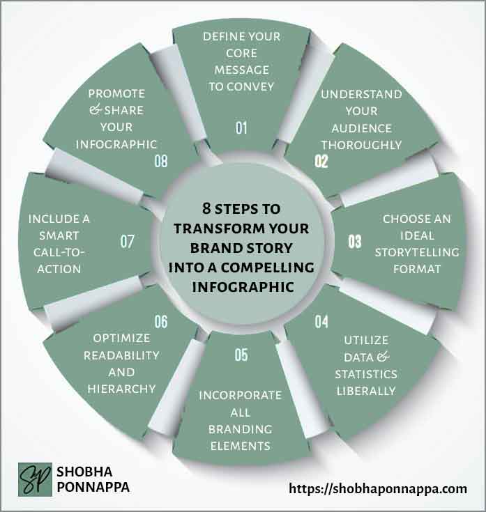
Establishing a clear, core message is the foundation upon which effective infographics are built, serving as a beacon that guides every design choice and piece of content included.
Imagine a company that sells eco-friendly packaging solutions; their core message might revolve around sustainability and innovation in reducing waste. This message dictates the infographic’s narrative, focusing on visualizing the environmental impact of traditional packaging versus their eco-friendly alternatives, incorporating compelling statistics about waste reduction and testimonials from businesses that have made the switch.
Such a focused approach ensures that the infographic not only educates the audience about the problem and the company’s solution but also aligns seamlessly with broader content marketing goals. By articulating this core message visually, the company strengthens its brand identity as a leader in sustainability, encouraging engagement, sharing, and ultimately driving conversion.
This strategy highlights the importance of a well-defined core message in crafting infographics that resonate with audiences and amplify a brand’s story within its content marketing efforts.

Consider the idea of “Narrative Inversion.” This unusual enhancement involves flipping the conventional narrative to present the core message from a unique or unexpected angle, sparking curiosity and engagement. Instead of merely stating the benefits of eco-friendly packaging, “Narrative Inversion” would tell the story from the perspective of the environment itself, personifying nature to express gratitude for the reduced impact and highlighting the positive changes brought about by adopting sustainable packaging solutions.
This approach not only makes the core message more memorable but also deeply personalizes the issue, encouraging viewers to consider the broader implications of their packaging choices on the world around them.
Thoroughly understanding your audience is crucial for designing infographics that resonate and drive engagement. By delving into the demographics, preferences, challenges, and online behavior of your target audience, you tailor content to their interests and needs, ensuring relevance and connection.
For example, if an eco-friendly packaging company identifies its primary audience as small business owners in the food industry concerned about sustainability, the infographic could focus on how switching to eco-friendly packaging can enhance brand reputation, attract eco-conscious customers, and comply with environmental regulations.
This precise targeting ensures that the content directly addresses the audience’s specific concerns and aspirations, making the infographic not just informative but also actionable.
Such an approach amplifies the effectiveness of content marketing efforts by fostering deeper engagement, encouraging shares, and ultimately driving conversions, as the content speaks directly to the audience’s values and needs, demonstrating a clear understanding of their world.
Consider the idea of “Empathetic Mirroring.” This unusual enhancement goes beyond traditional audience research, delving into the emotional and psychological landscape of your target audience to create a deeply resonant infographic. By employing psychological principles and emotional intelligence, “Empathetic Mirroring” reflects the audience’s feelings, aspirations, and concerns back at them in a compelling visual narrative.
For the eco-friendly packaging company targeting small business owners in the food industry, this could mean designing an infographic that not only highlights the environmental benefits of their products but also taps into the pride and challenges these owners face in making sustainable choices. By mirroring their journey towards sustainability, the infographic fosters a deeper emotional connection, encouraging engagement and action through a shared sense of purpose and identity.
Choosing the ideal storytelling format is essential for crafting infographics that effectively convey your brand’s narrative, ensuring the message is not only received but also retained. This decision should stem from the core message you wish to communicate and the most engaging way to present this to your audience.
For example, if a company specializing in renewable energy solutions wants to highlight the journey from traditional to renewable energy sources, a timeline format could illustrate the evolution of energy, significant milestones, and the future outlook.
This method allows the audience to visualize progress and understand the impact of renewable energy over time. Tailoring the storytelling format to the message enhances the infographic’s ability to educate, persuade, and inspire, making it a powerful tool in a content marketer’s arsenal.
By thoughtfully aligning the format with the content’s objective, brands can create compelling narratives that resonate with their audience and encourage deeper engagement with the topic.
Consider the idea of “Interactive Storyscapes.” This unusual enhancement reimagines the infographic format by integrating interactive elements that allow viewers to navigate through the story in a non-linear fashion, based on their interests and choices. Instead of a static timeline for the renewable energy company’s journey, “Interactive Storyscapes” would present a digital landscape where users can click on different points or icons to explore various milestones, technologies, and future predictions at their own pace.
This method transforms the viewing experience into an engaging exploration, making the narrative more immersive and personalized. It encourages deeper engagement as users actively participate in uncovering the story, enhancing retention and impact by catering to individual curiosity and learning preferences.
Utilizing data and statistics liberally within infographics is a powerful way to bolster credibility, provide clear evidence, and make complex information accessible.
For example, a healthcare company aiming to showcase the effectiveness of a new wellness program could leverage statistics to illustrate participant health improvements over time, such as a 30% reduction in stress levels and a 25% increase in physical activity among participants after six months.
By presenting this data visually through graphs and charts, the infographic transforms abstract numbers into compelling, easy-to-understand evidence of the program’s benefits. This not only educates the audience about the program’s impact but also builds trust in the company’s claims.
In content marketing, such data-driven infographics serve as persuasive tools, enhancing the story by grounding it in reality and making it more relatable and convincing to the target audience, thereby increasing engagement and driving action.
Consider the idea of “Data Storytelling Through Time Travel.” This unusual enhancement involves presenting data and statistics not just as current facts but as a journey through time, showing past, present, and projected future states. By adopting a time-travel approach, an infographic can bring to life the evolution of data, offering a dynamic narrative that captivates the audience’s imagination.
For the healthcare company showcasing its wellness program’s effectiveness, this method could visually depict the health trajectory of participants before joining, the immediate impact after six months, and anticipated benefits in the future. This approach not only highlights the program’s success but also invites the audience to envision the long-term possibilities, making the data more compelling and the brand story more profound and engaging.
Incorporating all branding elements into infographics is essential for maintaining brand consistency and recognition across all marketing materials. This strategy ensures that every piece of content, including infographics, communicates the brand’s identity through consistent use of logos, color schemes, typography, and imagery.
For instance, a technology company specializing in cybersecurity solutions could design an infographic that uses its brand colors—perhaps a distinctive shade of blue and grey—to visualize data on the latest cybersecurity threats and the effectiveness of their products.
By applying these colors, along with the company’s logo and preferred typeface, the infographic not only conveys valuable information but also reinforces the brand’s visual identity. This cohesive approach enhances the audience’s ability to associate the content with the brand, strengthening brand recall and loyalty.
It underscores the importance of visual consistency in content marketing, as it builds a coherent brand story that resonates with the audience and sets the brand apart in a crowded market.
Consider the idea of “Brand Sensory Layers.” This unusual enhancement extends beyond visual branding elements to incorporate sensory experiences that can be associated with a brand, even within a digital infographic. For the technology company focusing on cybersecurity, alongside using consistent colors, typography, and logos, “Brand Sensory Layers” could mean integrating elements that evoke a sense of security and innovation, such as interactive features that mimic the process of encryption or digital protection in action.
These could be sound effects that play when a user hovers over parts of the infographic or tactile feedback for touchscreen devices, creating a multi-sensory experience. This approach deepens the brand’s impact by engaging more of the audience’s senses, making the brand experience more memorable and engaging, and reinforcing the message of security and innovation in a tangible way.
Optimizing readability and hierarchy is crucial in infographic design to ensure that the intended message is easily accessible and engaging to the audience. By organizing information logically and emphasizing key points through font size, color contrasts, and spatial arrangement, designers can guide viewers through the content effortlessly.
For instance, a nonprofit organization focusing on water conservation might create an infographic that starts with bold, eye-catching statistics about global water scarcity at the top, followed by a section detailing the causes, and concluding with impactful ways individuals can reduce water usage.
This structured approach not only makes the infographic more readable but also helps in retaining viewer interest by gradually building up to actionable advice.
Effective use of hierarchy and readability techniques enhances the viewer’s understanding and engagement, making the content more impactful and shareable, which is a fundamental goal of content marketing strategies aiming to spread awareness and inspire action.
Consider the idea of “Dynamic Layering.” This unusual enhancement involves creating infographics with elements that change or reveal more depth as the viewer interacts with them, such as hover effects or clickable areas that expand to provide additional information. For the water conservation nonprofit, “Dynamic Layering” could mean initially displaying striking statistics about water scarcity with an overlay that, when hovered over, expands to show more detailed data, personal stories, or interactive maps of affected regions.
This method not only optimizes readability by preventing information overload but also engages viewers by inviting them to explore the content more deeply. It introduces a hierarchy of information that is interactive, making the infographic not just a visual experience but an engaging journey through the content, enhancing the viewer’s understanding and retention of the message.
Including a smart call-to-action (CTA) within an infographic is a strategic move that transforms passive viewing into active engagement, guiding the audience toward a desired action that aligns with the brand’s objectives.
For instance, after presenting compelling statistics and stories about water conservation, a nonprofit could conclude its infographic with a CTA encouraging viewers to sign up for a newsletter for more tips on saving water, or to donate to support water conservation projects.
This not only provides viewers with a clear next step after absorbing the information but also leverages the infographic’s persuasive power to foster deeper involvement with the cause.
A well-crafted CTA is crucial for maximizing the impact of content marketing efforts, turning interest and awareness generated by the infographic into tangible outcomes, such as increased subscriptions, donations, or awareness about an important issue, thereby amplifying the brand story’s reach and effectivity.
Consider the idea of “Gamified Engagement CTA.” This unusual enhancement introduces an interactive, game-like element to the call-to-action, significantly boosting its appeal and effectiveness. Instead of a traditional static CTA, “Gamified Engagement CTA” might involve a mini-quiz related to the infographic content, with the final step being the desired action, such as signing up for a newsletter to get the quiz results or to learn more about water conservation.
For the nonprofit focusing on water conservation, this could mean engaging viewers with questions about their daily water usage and offering personalized tips for improvement upon completion. This method not only encourages active participation but also personalizes the experience, making the audience more likely to engage with the CTA and take the desired action, thereby deepening their connection with the brand story and its objectives.
Promoting and sharing your infographic is essential to ensure it reaches and resonates with a wide audience, amplifying its impact. Leveraging multiple channels for distribution, such as social media platforms, email newsletters, and your website, maximizes visibility and engagement.
For example, a company specializing in sustainable living products could share their infographic on the environmental benefits of their products across LinkedIn for professional audiences, Instagram for visual appeal to younger demographics, and through an email campaign targeting existing customers.
Additionally, partnering with influencers or industry blogs for further dissemination can extend reach beyond the company’s immediate network, attracting new followers and potential customers. Embedding share buttons directly on the infographic and encouraging viewers to share it on their networks fosters organic spread, enhancing the content’s visibility and effectiveness as a marketing tool.
This strategic promotion not only educates the audience about sustainable living but also drives brand awareness and product interest, illustrating the power of well-distributed infographics in content marketing strategies.
Consider the idea of “Interactive Sharing Triggers.” This unusual enhancement involves embedding interactive elements within the infographic itself that unlock special content or rewards when shared. For the sustainable living products company, this could mean incorporating a feature where viewers can click a “Share to Unlock” button directly on the infographic, revealing exclusive tips, discounts, or an entry into a giveaway upon sharing the infographic on their social media.
This method not only incentivizes the audience to distribute the content more widely but also creates a sense of participation and reward associated with the act of sharing. It leverages the natural human inclination towards curiosity and rewards, significantly boosting the infographic’s visibility and engagement across platforms, thereby amplifying the brand story in an interactive and memorable way.
Blend of conventional and unusual: The success of an infographic in telling a compelling brand story lies in the strategic blend of time-tested content marketing approaches with innovative, unusual twists. This combination ensures that the content not only resonates with the audience through familiar formats but also stands out through unique engagement methods, making the brand’s message memorable.
Audience-centric design: Understanding and targeting the specific needs, preferences, and behaviors of the intended audience are crucial. Tailoring the infographic’s design, message, and distribution channels to the audience ensures higher engagement rates and a stronger connection between the brand and its consumers.
Strategic promotion and engagement: The promotion and sharing of an infographic are as critical as its creation. Utilizing a mix of digital platforms, from social media to email marketing, and incorporating interactive elements encourage wider dissemination and active participation, significantly amplifying the brand’s reach and impact.

"As a Content/Brand Specialist, and SEO/UX Writer, I can help transform your brand's online presence. I can lift it with innovative ideas to take it to an enviable position. Let's collaborate to create a captivating brand story, engage your audience, boost your online visibility, and increase your ROI. Take the next step towards your brand content success and contact me today."
Shobha Ponnappa
I Bring You:
Content Marketing That’s “Unusual By Strategy” … Tips, Tricks, Tactics, Techniques, Trends, Training.
Get my weekly ContenTracker Newsletter packed with loads of content marketing ideas – proven and unusual.
Get a free download of my ebook on “50 Unusual Ways To Use AI In Content Marketing” … and transform your success.
Just fill in the form to join my community … we have big and small brands for company. You’ll stay on the speedway to growth.
KEY TOPIC CATEGORIES COVERED ON THIS SITE:
COPYRIGHT © 2024. SHOBHAPONNAPPA.COM. ALL RIGHTS RESERVED.
Just fill in this form and get this awesome ebook in your email inbox. Plus … each week you’ll receive my ContenTracker Newsletter that brings you tips, tricks, tactics, techniques, trends, and training on the latest in content marketing.