
Infographics stand out as a powerful solution, blending aesthetic appeal with informational clarity. To truly excel in infographic design, however, one must go beyond traditional approaches.
Incorporating a blend of time-tested methods with innovative, unusual strategies is crucial to creating a stunning outcome.
This combination ensures your content not only attracts but also retains viewer interest, making your message both memorable and impactful.
Leveraging this dual approach allows for the creation of infographics that not only inform but also inspire and engage the audience on a deeper level.
Infographics are highly valuable in both development and promotion because they transform complex information into visually appealing, easily digestible formats, making them an indispensable tool in capturing and retaining audience attention in a crowded digital landscape.
By combining compelling visuals with concise textual information, infographics facilitate quicker understanding and retention of information, significantly enhancing the communication of intricate data and narratives. This visual format appeals to the visual nature of human cognition, enabling viewers to grasp complicated concepts or data sets at a glance.
Additionally, infographics are highly shareable across social media platforms and websites, boosting visibility and engagement. Their versatility also allows for effective storytelling across various industries, from marketing to education, making them a powerful asset for content creators aiming to convey messages clearly and engagingly.
The ability to condense vast amounts of data into an accessible and engaging format not only elevates the user experience but also significantly increases the likelihood of content being shared, driving traffic, and enhancing brand recognition.
Leveraging a blend of proven and unusual ideas for developing stunning infographics is central to my “Unusual By Strategy” forte, emphasizing the importance of innovating beyond conventional boundaries to achieve standout results.
This approach combines traditional design principles with inventive techniques, such as utilizing augmented reality (AR) to create interactive infographics that come alive when viewed through a smartphone camera, adding a layer of engagement and surprise. Incorporating storytelling through data, where numbers are woven into compelling narratives, transforms standard infographics into memorable visual stories that resonate on a deeper level with audiences.
Experimenting with unconventional data visualization formats, like isometric graphics or dynamic timelines, can turn ordinary data into captivating visual experiences. This strategy also involves tapping into the psychology of color to evoke specific emotions or actions, ensuring that every design element serves a purpose beyond aesthetics.
By marrying the reliability of tried-and-true methods with the excitement of novel concepts, my approach guarantees infographics that are not only visually stunning but also deeply impactful, setting a brand apart in the digital landscape.
Leveraging my 40+ years’ experience as a Brand Content Strategist with a penchant for the unusual, I have given 8 ideas below that incorporate time-tested approaches proven to develop visually stunning infographics effortlessly, along with unusual twists to make these ideas work even harder. These strategies blend conventional wisdom with innovative tactics, ensuring that every infographic not only captures attention but also leaves a lasting impact.
By applying these principles, we can transform complex data into captivating visual stories, making information not just accessible but also engaging, thus elevating brand messaging to new heights with creativity and strategic insight.
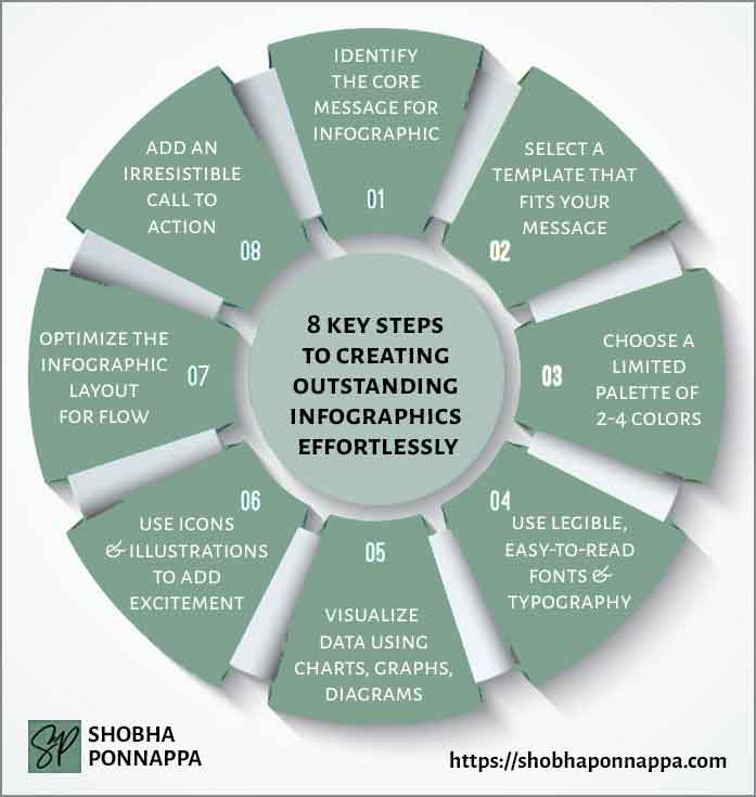
Identifying the core message for your infographic is crucial, as it serves as the foundation upon which all design and content decisions are based. Imagine you’re creating an infographic for a health and wellness brand aiming to showcase the benefits of a plant-based diet.
The core message might be “Plant-based diets contribute significantly to overall health and environmental sustainability.” This message guides the selection of data, visuals, and narratives that underscore the diet’s health benefits and its positive impact on the planet. It ensures that every element of the infographic aligns with the overarching theme, making the final product not only visually appealing but also informative and persuasive.
Such clarity and focus are essential in content marketing, where the goal is to engage and convert the target audience by providing them with valuable and relevant information.
A well-defined core message ensures that the infographic resonates with viewers, compelling them to share the content, thus amplifying the brand’s reach and impact in the market.

Consider the idea of “Narrative Immersion.” This unusual enhancement involves embedding your core message within a captivating story or scenario that directly involves your audience, making the infographic not just informative but also personally engaging. By crafting a narrative that viewers can see themselves in, you transform data into a relatable experience.
For instance, in creating an infographic about the benefits of a plant-based diet, instead of merely presenting facts, you could frame the core message through a day in the life of someone who has embraced this lifestyle. Highlight their journey, the changes they’ve experienced in their health and environment, making the information more impactful by showing real-life implications. This approach not only conveys the core message but also emotionally connects with the audience, enhancing retention and shareability.
Selecting a template that aligns perfectly with your core message is akin to choosing the right frame for a masterpiece painting; it enhances the presentation and ensures that the content is communicated effectively. You can look for a template on sites like Canva or Venngage.
For example, if the core message of your infographic is to highlight the rapid growth of renewable energy sources over the last decade, choosing a template that allows for dynamic timelines and comparative charts is crucial. This not only makes the data more accessible but also more compelling to the viewer.
In content marketing, this strategic alignment between message and medium can significantly boost engagement rates, as it caters to the audience’s preferences for consuming information. A well-chosen template acts as a visual guide, leading the viewer’s eye through the information in a logical and aesthetically pleasing manner.
By meticulously matching the template to the core message, content marketers can ensure that their infographics are not just seen but remembered and acted upon, thereby enhancing the effectiveness of their overall marketing strategy.
Consider the idea of “Dynamic Adaptation.” This unusual enhancement involves selecting a template that not only fits your core message but also dynamically adjusts based on user interaction or data updates. For instance, when showcasing the growth of renewable energy sources, a dynamically adaptive template could alter its display or content focus based on the viewer’s geographical location or the most current data available.
This means if a viewer from Europe is looking at the infographic, the template might highlight renewable energy trends specific to Europe. Similarly, as new data becomes available, the infographic could update in real time, keeping the information fresh and relevant. This approach not only ensures that the template aligns with the core message but also adds an interactive, personalized layer to the infographic, greatly enhancing viewer engagement and the infographic’s overall impact.
Choosing a limited color palette of 2-4 colors is a strategic decision that significantly enhances the visual coherence and impact of an infographic. This approach ensures that the design remains clean and focused, guiding the viewer’s attention to the key elements without overwhelming them with visual clutter.
For example, when creating an infographic about water conservation, a palette limited to shades of blue, green, and grey can effectively evoke feelings of freshness, growth, and responsibility. This careful selection of colors not only reinforces the infographic’s core message but also strengthens brand identity by using colors associated with the brand’s visual language.
In content marketing, where the goal is to communicate complex information quickly and memorably, a well-chosen color palette can make an infographic stand out, encouraging sharing and engagement.
The simplicity of a limited palette also aids in the retention of the presented information, making it a powerful tool in creating content that resonates with audiences and drives home the intended message.
Consider the idea of “Interactive Color Engagement.” This unusual enhancement involves designing your infographic with a limited color palette that dynamically changes based on user interaction. For instance, in an infographic about water conservation, initially presented in calming shades of blue and green, users could hover over or click on specific elements, causing the color scheme to shift subtly to highlight areas of concern or success in water conservation efforts.
This method not only emphasizes the infographic’s key points through visual cues but also engages users on a deeper level, encouraging them to interact with the content and discover insights actively. By integrating interactive color changes, the infographic becomes a more engaging, memorable experience, enhancing the viewer’s understanding and retention of the core message.
Using legible typography of easy-to-read fonts is essential for ensuring that your infographic communicates its message clearly and effectively. Consider an infographic designed to detail the steps for starting an organic garden.
If the typography chosen is too ornate or small, vital information might become difficult for the audience to decipher, detracting from the content’s value and accessibility. By selecting fonts that are clear and sizeable, you make it effortless for viewers to grasp the key points at a glance, enhancing their understanding and retention of the information.
This approach not only improves the user experience but also amplifies the infographic’s effectiveness as a content marketing tool. Clear typography supports the infographic’s goal to educate and engage, making it more likely for the content to be shared and acted upon.
In an age where content is abundant, the readability of your infographic can significantly influence its ability to stand out and resonate with the intended audience, thereby reinforcing the brand’s message and value proposition.
Consider the idea of “Typography Animation.” This unusual enhancement involves integrating subtle animations into your font choices, bringing text to life, and capturing the viewer’s attention in a novel way. For instance, in an infographic about starting an organic garden, key steps or statistics could be highlighted through animated typography that blooms or grows as the viewer scrolls.
This not only makes the infographic more engaging but also emphasizes important points, making them memorable. By animating the typography, you’re not just presenting information; you’re creating an interactive experience that draws the viewer into the narrative, enhancing their connection to the content and making the core message of sustainable gardening stand out vividly.
Visualizing data using charts, graphs, and diagrams is a cornerstone of creating infographics that not only capture attention but also facilitate understanding at a glance. Imagine an infographic designed to show the impact of a new recycling program over a year.
By employing a combination of bar charts to represent monthly increases in recycling rates and pie charts to illustrate the types of materials recycled, the infographic quickly communicates success and highlights areas for improvement.
This method of presenting data makes complex information accessible, engaging, and memorable, crucial qualities in content marketing where conveying your message effectively can significantly influence audience behavior. Effective data visualization empowers viewers to grasp detailed insights without wading through dense text, making your content more likely to be shared and acted upon.
This approach not only enhances the infographic’s visual appeal but also strengthens its role as a persuasive tool in a marketer’s arsenal, driving home messages with clarity and impact.
Consider the idea of “Dynamic Data Storytelling.” This unusual enhancement involves layering your charts, graphs, and diagrams with a narrative that unfolds as the viewer interacts with the data. For the infographic detailing the impact of a new recycling program, Dynamic Data Storytelling could mean integrating elements that change or evolve as the viewer scrolls, such as a line chart that grows to show the increase in recycling rates over the months.
This method not only visualizes the data but also tells a story, making the statistics more relatable and impactful. It transforms static data into a compelling journey, emphasizing the program’s success and areas for improvement in an engaging, memorable way. Through this approach, viewers are not just seeing numbers but are taken on a narrative-driven exploration of the data, enhancing their understanding and connection to the content.
Employing icons and illustrations adds a layer of excitement and visual appeal to infographics, making complex information more accessible and engaging.
For instance, when explaining the process of photosynthesis in an educational infographic, using colorful illustrations of the sun, water, and leaves, alongside icons representing energy and carbon dioxide, can transform a potentially dry topic into a visually stimulating and easy-to-understand narrative. This approach not only captures the viewer’s attention but also aids in memory retention by associating abstract concepts with concrete images.
In content marketing, leveraging such visual elements can significantly enhance the shareability of your content, as visually appealing and easily digestible pieces are more likely to be circulated among audiences.
This strategy boosts engagement, extends the reach of your message, and establishes a stronger connection between your brand and its audience, illustrating the power of visuals in conveying complex information in an entertaining and informative way.
Consider the idea of “Interactive Story Illustrations.” This unusual enhancement involves integrating icons and illustrations that become interactive when engaged with, offering a deeper dive into the content through animations or additional data. For instance, in an infographic about the photosynthesis process, an illustration of a leaf could animate to show water and carbon dioxide entering the leaf and oxygen and glucose being produced when clicked or hovered over.
This not only adds an element of excitement and engagement but also enriches the educational value of the infographic by providing a more immersive learning experience. Such interactive elements encourage viewers to spend more time with the content, enhancing their understanding and retention of the information while making the infographic itself more memorable and shareable.
Optimizing the layout of an infographic for flow is critical to ensure that information is not only presented clearly but also guides the viewer through the content in a logical and engaging manner.
Consider an infographic designed to explain the lifecycle of a product, from concept to consumer. The layout should start with the ideation phase at the top, followed by design, production, marketing, and finally, consumer engagement at the bottom.
This top-to-bottom flow mimics the natural progression of the product’s journey, making it intuitive for viewers to follow. By carefully planning this layout, content marketers can craft a narrative that not only educates but also leads the audience through a story, increasing engagement and comprehension.
Proper flow makes the infographic more than just a collection of facts; it becomes a cohesive story that holds the viewer’s interest, making the content more effective and likely to be shared, thereby amplifying its reach and impact in content marketing campaigns.
Consider the idea of “Narrative Zoom.” This unusual enhancement transforms the infographic layout by allowing viewers to “zoom in” on different sections for more detailed stories or data, effectively turning a static layout into an interactive exploration. In the context of illustrating the lifecycle of a product, from concept to consumer, Narrative Zoom enables viewers to click on a phase like the design stage and delve deeper into specifics, such as design challenges and solutions.
This not only optimizes the flow by maintaining a clean, overarching structure but also caters to viewers seeking more in-depth information, enriching their understanding and engagement with the content. This approach creates a dynamic viewing experience, encouraging viewers to interact with the infographic and explore the product’s journey on multiple levels, making the content more engaging and memorable.
Adding an irresistible call-to-action (CTA) at the conclusion of an infographic is a pivotal strategy to convert viewer interest into actionable engagement. Imagine an infographic detailing the benefits of sustainable living, meticulously guiding the viewer through statistics, benefits, and methods of adopting a greener lifestyle.
By ending this visual journey with a compelling CTA, such as “Join the Green Revolution Today,” and providing a link to sign up for a newsletter or download a guide on sustainable practices, you capitalize on the viewer’s heightened interest and awareness.
This not only serves to extend the relationship between the viewer and your content beyond the initial engagement but also transforms passive viewers into active participants.
In content marketing, this step is crucial for driving conversions, building a community around your brand, and enhancing the effectiveness of your informational outreach, ensuring that your well-crafted content yields tangible results.
Consider the idea of “Dynamic Engagement CTA.” This unusual enhancement transforms the traditional call-to-action into an interactive experience that adapts based on the sections of the infographic the viewer spends the most time with. For instance, in an infographic about sustainable living, if a viewer lingers on the segment about reducing water usage, the Dynamic Engagement CTA could offer a personalized invitation to download a guide specifically on water-saving techniques.
This approach not only makes the CTA irresistibly relevant to the viewer’s interests but also significantly increases the likelihood of engagement. By leveraging data on viewer interaction, the CTA becomes a powerful tool for capturing leads and fostering a deeper connection with the content, ensuring the call-to-action is not just seen but acted upon.
Define your core message clearly: Establishing a concise and compelling core message is crucial for guiding the design and content of your infographic, ensuring that every element aligns with the overall goal.
Employ visual elements strategically: The use of charts, graphs, icons, and illustrations is essential for breaking down complex information into digestible, engaging content that captures and retains the audience’s attention.
Optimize for action: Incorporating an irresistible call-to-action, tailored to the viewer’s interests and interactions with the content, is key to converting engagement into measurable outcomes.

"As a Content/Brand Specialist, and SEO/UX Writer, I can help transform your brand's online presence. I can lift it with innovative ideas to take it to an enviable position. Let's collaborate to create a captivating brand story, engage your audience, boost your online visibility, and increase your ROI. Take the next step towards your brand content success and contact me today."
Shobha Ponnappa
I Bring You:
Content Marketing That’s “Unusual By Strategy” … Tips, Tricks, Tactics, Techniques, Trends, Training.
Get my weekly ContenTracker Newsletter packed with loads of content marketing ideas – proven and unusual.
Get a free download of my ebook on “50 Unusual Ways To Use AI In Content Marketing” … and transform your success.
Just fill in the form to join my community … we have big and small brands for company. You’ll stay on the speedway to growth.
KEY TOPIC CATEGORIES COVERED ON THIS SITE:
COPYRIGHT © 2024. SHOBHAPONNAPPA.COM. ALL RIGHTS RESERVED.
Just fill in this form and get this awesome ebook in your email inbox. Plus … each week you’ll receive my ContenTracker Newsletter that brings you tips, tricks, tactics, techniques, trends, and training on the latest in content marketing.