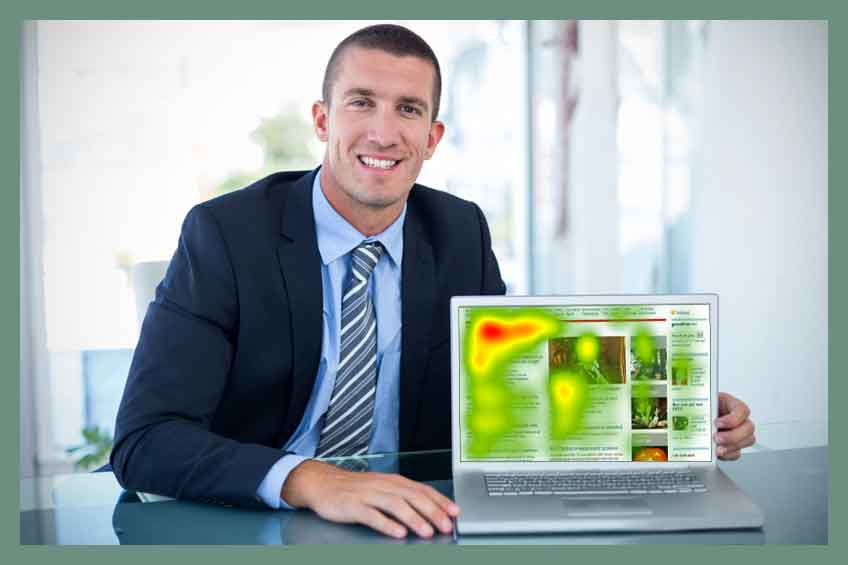
Understanding how users interact with your content is crucial for effective content strategy. One powerful but often underutilized tool for gaining these insights is the use of heat maps.
These visual data representations can unveil how visitors navigate your website, and which parts of your page capture their attention.
Embracing this approach requires a blend of traditional and innovative methods. Conventional analysis provides a solid foundation, but incorporating unconventional strategies allows for a more comprehensive understanding, pushing the boundaries of user experience optimization.
This dual approach ensures a more dynamic and effective way to enhance content engagement.
Heat maps are graphical representations of data where individual values contained in a matrix are represented as colors. In the context of website analytics, they are invaluable tools for understanding user behavior, showing where visitors focus their attention, click, and scroll on a webpage.
Different colors indicate varying levels of activity; warmer colors like reds and oranges often represent higher engagement, while cooler colors like greens and blues signify less interaction. By visualizing these interactions, heat maps provide clear, actionable insights into user behavior.
This makes them especially useful for content marketers and website designers looking to optimize their pages. They can identify which parts of a webpage are most engaging, where users lose interest, and how far down they are willing to scroll.
This data is crucial for improving website layout, content placement, and overall user experience, ensuring that the most valuable content is placed where it is most likely to be seen and interacted with, ultimately driving better engagement and conversion rates.
Brands looking to optimize their digital presence can greatly benefit from the strategic use of heat maps, a tool that visually represents user interaction on websites.
The conventional approach involves analyzing areas with the most clicks or the highest scroll depth, providing valuable insights into user behavior and content effectiveness. However, embracing my “Unusual By Strategy” forte means going beyond standard practices. For instance, brands can experiment with temporal heat map analysis, tracking how user interaction patterns change at different times of the day or week.
This can reveal when audiences are most engaged, helping to time content updates or promotions more effectively. Another innovative method is correlating heat map data with external events or marketing campaigns to understand their impact on user behavior.
This blend of traditional and novel techniques allows brands to not only comprehend user preferences but also to anticipate and proactively respond to changing trends, keeping their digital strategy agile and responsive.
Leveraging my 40+ years’ experience as a Brand Content Strategist with a penchant for the unusual, I have crafted eight ideas below that incorporate time-tested approaches for using heatmaps to understand content interaction. These ideas are not only rooted in proven strategies but also include unique twists to enhance their effectiveness.
By blending conventional wisdom with innovative techniques, each suggestion is designed to offer a deeper, more nuanced understanding of user engagement, ensuring that your content not only resonates with your audience but also stands out in a highly competitive digital landscape.
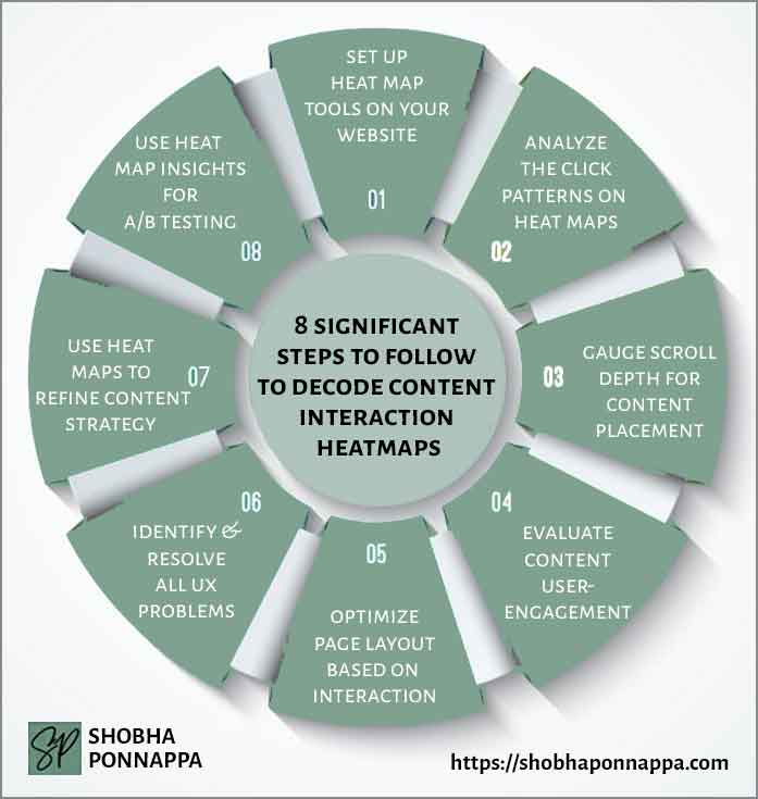
Setting up heat map tools on your website is a fundamental step in understanding how visitors interact with your content. By integrating tools like Crazy Egg or Hotjar, you can visually track where users click, how far they scroll, and which parts of your page capture their attention.
Imagine a scenario where a content marketer notices that the majority of clicks on their product page are concentrated around a testimonial video, rather than the ‘Buy Now’ button.
This insight could lead to a strategic shift, placing more emphasis on video content or repositioning the purchase button to a more engaged area of the page. Such data-driven adjustments are crucial for optimizing the user experience and increasing conversion rates.
Heat maps also offer the advantage of real-time feedback, allowing for agile content strategy changes that align with actual user behavior. In essence, they act as a bridge between content creation and user interaction, providing tangible metrics to refine and enhance content marketing efforts.

Consider the idea of “Dynamic Heat Map Segmenting.” This unusual enhancement involves setting up your heat map tool to segment user interactions by different audience demographics or behavior patterns. For instance, you might track how new visitors interact with your site differently from returning users.
Apply this to the earlier example: If the content marketer notices that new visitors primarily click on informational content while returning users engage more with the testimonial video and ‘Buy Now’ button, this insight could lead to a more tailored content strategy. Segmenting heat maps in this way allows for a deeper, more targeted understanding of different user segments, enabling the creation of highly personalized content experiences.
One of the most insightful uses of heat maps is analyzing click patterns, which allows content marketers to visualize where users are most engaged on a webpage. By examining areas with high concentrations of clicks, it’s possible to determine which elements—be it text, images, or calls-to-action—are capturing user attention.
For example, a content marketer might discover that despite a well-designed layout, the majority of clicks are on a less prominent blog post link, rather than the main featured product. This could indicate that visitors are more interested in informational content than direct sales pitches, leading to a strategic shift in content focus.
Such insights are invaluable for refining the user experience, ensuring that key elements are optimally positioned to align with user interests and behaviors.
Effectively analyzing click patterns not only enhances website navigation and layout but also guides content creators in developing material that resonates more deeply with their audience, ultimately driving higher engagement and conversion rates.
Consider the idea of “Behavioral Click Path Analysis.” This unusual enhancement involves tracing the sequence of clicks a user makes during their visit, rather than just analyzing isolated click hotspots. It provides a narrative of the user journey across the page, offering insights into how different content elements lead to user actions.
Applying this to the scenario where a content marketer found more clicks on a blog post link than the main product: Behavioral Click Path Analysis might reveal that users first click on an engaging headline, then a compelling image, before reaching the blog link. This sequential insight could guide the marketer to strategically place content to create a more persuasive user journey, potentially leading users more effectively towards desired actions like product exploration or purchases.
Gauging scroll depth with heat maps is a vital strategy for determining how far down users are engaging with a webpage, which directly influences content placement decisions. By analyzing scroll maps, content marketers can pinpoint the exact location where user engagement drops, indicating the need to reposition key information or calls to action.
For example, if a marketer observes that the majority of users stop scrolling halfway through a product page, vital information placed at the bottom, such as customer testimonials or special offers, might not be seen.
This insight would prompt the marketer to move these elements higher up on the page, ensuring greater visibility and engagement. Such adjustments are crucial for optimizing the user experience and can significantly impact conversion rates.
Scroll depth analysis not only helps in arranging existing content more effectively but also guides the creation of future content, ensuring it is structured in a way that aligns with typical user behavior and preferences.
Consider the idea of “Interactive Scroll Engagement.” This unusual enhancement involves integrating interactive elements at various scroll depths to actively engage users and encourage deeper page exploration. For instance, in the scenario where users typically stop scrolling halfway through a product page, introducing an interactive element like a mini-quiz or poll related to the content at this point can pique interest and entice users to scroll further.
This method not only increases the time spent on the page but also provides additional data on user preferences and behaviors, based on their interactions with these elements. Such a strategy transforms passive scrolling into an active experience, potentially uncovering new insights into user engagement and content effectiveness.
Evaluating user engagement with content through heat maps offers a visual representation of where visitors spend time on a webpage, which is crucial for content marketers seeking to optimize their strategies.
For example, a marketer might observe through heat map analysis that users spend a significant amount of time hovering over an infographic on a blog post. This observation suggests that the infographic is particularly engaging or informative, prompting the marketer to consider using similar visual elements in future content.
Such insights are invaluable, as they not only indicate which aspects of a page are most engaging but also guide the creation of future content. By understanding what captures and holds user attention, marketers can tailor their content to match user preferences, thus enhancing the overall effectiveness of their content strategy.
This approach ensures that the content not only attracts visitors but also keeps them engaged, increasing the likelihood of achieving desired outcomes, such as conversions or brand loyalty.
Consider the idea of “Emotion Tracking Analysis.” This enhancement involves integrating advanced analytics to interpret emotional responses from user interactions, going beyond traditional heat map data. For instance, in evaluating user engagement with an infographic on a blog post, this method could use cursor speed and movement patterns to infer user emotions like excitement or confusion.
If the cursor moves rapidly over certain sections, it might indicate confusion, prompting a content review for clarity. Conversely, longer dwell times coupled with smoother cursor movements could signify interest or satisfaction. This deeper layer of analysis provides valuable insights into not just where users engage, but how they emotionally connect with the content, enabling more nuanced and effective content optimization strategies.
Optimizing page layout based on interaction is a crucial strategy for enhancing user experience and boosting engagement. Heat maps play a vital role in this process by visually displaying where users click, move, and scroll.
For instance, a content marketer might find that the majority of clicks on a homepage are concentrated around the top right corner, possibly on a specific call-to-action button. This insight could lead to a strategic redesign, perhaps by placing the most important information or additional CTAs in this high-engagement area.
Similarly, if heat maps show that users rarely scroll past the halfway point of a long-form article, the marketer might decide to condense the content or rearrange it to ensure key messages are visible without scrolling. This approach allows for a more data-driven design, ensuring that the layout resonates with user preferences and behaviors.
By continually adapting the layout based on user interactions, content marketers can create more engaging, user-friendly websites that effectively communicate their message and drive desired actions.
Consider the idea of “Predictive Interaction Mapping.” This enhancement involves using AI algorithms in conjunction with heat map data to predict future user interactions based on current trends. For instance, in the scenario where a content marketer observes that most clicks on a homepage are around the top right corner, Predictive Interaction Mapping could suggest potential future hotspots based on evolving user behaviors.
This could lead to preemptively redesigning other areas of the page that show potential for increased engagement, rather than waiting for the trends to become apparent. Such a proactive approach ensures the page layout stays ahead of user trends, continually optimizing for engagement and interaction in a dynamic, user-responsive manner.
Identifying and resolving UX problems is a critical aspect of enhancing a website’s performance, and heat maps are instrumental in this process. They provide visual insights into areas where users might be facing difficulties.
For example, if a content marketer notices through a heat map that users frequently click on a non-clickable element, it suggests a misleading design that could be frustrating for visitors. By making this element clickable or redesigning it to reduce confusion, the marketer can improve the user experience significantly.
Similarly, if a heat map shows that users are not interacting with a crucial section of a page, it might indicate that the content or design is not appealing or visible enough. Addressing these issues can lead to a more intuitive and user-friendly website, ensuring that visitors can easily find and engage with the content they are interested in.
This approach not only improves the overall user experience but also supports the website’s content marketing goals by facilitating smoother user journeys and enhancing engagement.
Consider the idea of “Emotive Response Tracking.” This unusual enhancement involves analyzing heat map data alongside emotional response indicators, such as cursor speed or click intensity, to gauge user frustration or satisfaction. For instance, if a content marketer observes users frequently clicking on a non-clickable element, Emotive Response Tracking might reveal rapid cursor movements or erratic clicking patterns around this area, indicating user frustration.
Understanding these emotional responses can guide not just the functional redesign of misleading elements, but also the emotional tuning of the user experience. Addressing both the practical and emotional aspects of UX can lead to a more intuitive and positively perceived website, enhancing overall user engagement and satisfaction.
Using heat maps to refine content strategy is an effective method for aligning your website’s content with user interests and behaviors. Heat maps provide visual data on how users interact with different elements of a webpage, such as text, images, and CTAs.
For example, a content marketer might discover through heat map analysis that a specific section of a blog post—perhaps a case study or a user testimonial—is receiving a disproportionately high amount of attention.
This insight can lead to a strategic shift in content creation, focusing more on developing similar types of content that resonate with the audience. Additionally, if certain areas of a webpage are consistently ignored, as indicated by cooler areas on the heat map, this might signal the need to either improve or remove these sections.
By continuously analyzing and adapting to these insights, content marketers can create a more engaging and relevant experience for their users, leading to improved engagement, higher retention, and ultimately, better conversion rates.
Consider the idea of “Contextual Content Evolution.” This unusual enhancement involves integrating heat map data with context-specific user behavior analytics, such as the source of the web traffic or the time spent on previous pages.
For instance, if a content marketer discovers that a blog post section about user testimonials garners significant attention, Contextual Content Evolution would analyze not just the heatmap data, but also consider if the users who focused most on this section came from a particular source, like social media or an email campaign. This layered analysis can guide the marketer to tailor future content not just based on what users engage with, but why and under what circums
Trying A/B testing with heat map insights is a powerful approach to optimize a website’s content and design for better user engagement. By comparing two versions of a page, marketers can see which elements perform best in terms of user interaction.
For instance, a marketer might use heat maps to track how users interact with two different layouts of a product page. One layout could have the call-to-action (CTA) button at the top, while the other places it at the bottom.
Heat map data from this A/B test could reveal that the top-placed CTA button results in more clicks and user engagement, indicating a more effective layout. This direct comparison provides concrete evidence of what works best for the audience, allowing for data-driven decisions in content strategy.
Such an approach not only enhances the user experience but also systematically improves the effectiveness of the website, ensuring that every element is optimized to drive user engagement and meet business objectives.
Consider the idea of “Sequential Interaction Analysis.” This unusual enhancement in A/B testing with heat maps involves not just comparing static user interactions on different webpage versions, but analyzing the sequence and progression of interactions over time. For example, in an A/B test where one layout has the CTA button at the top and another at the bottom, Sequential Interaction Analysis would track the order in which users interact with elements leading up to the CTA click.
This method can reveal if a particular sequence of engagement, like reading a testimonial before seeing the CTA, leads to higher conversion rates. This deeper level of analysis goes beyond traditional A/B testing, offering nuanced insights into how the arrangement of content elements can guide and influence the user’s journey toward the desired action.
Strategic use of heat maps for enhanced user understanding: Heat maps provide invaluable insights into user behavior on a website, revealing where they click, scroll, and focus their attention. This data is essential for tailoring content and layout to better match user preferences and behaviors.
Innovative approaches complement traditional methods: While traditional heat map analysis offers crucial insights, incorporating unusual techniques like Behavioral Click Path Analysis or Emotive Response Tracking adds depth to the understanding of user interactions, leading to more effective and emotionally resonant content strategies.
Continuous optimization through data-driven decisions: The integration of heat map insights with A/B testing and continuous analysis ensures that content and design strategies remain agile and responsive to user needs. This ongoing process of refinement and adaptation is key to maintaining an engaging, user-friendly, and effective online presence.

"As a Content/Brand Specialist, and SEO/UX Writer, I can help transform your brand's online presence. I can lift it with innovative ideas to take it to an enviable position. Let's collaborate to create a captivating brand story, engage your audience, boost your online visibility, and increase your ROI. Take the next step towards your brand content success and contact me today."
Shobha Ponnappa
I Bring You:
Content Marketing That’s “Unusual By Strategy” … Tips, Tricks, Tactics, Techniques, Trends, Training.
Get my weekly ContenTracker Newsletter packed with loads of content marketing ideas – proven and unusual.
Get a free download of my ebook on “50 Unusual Ways To Use AI In Content Marketing” … and transform your success.
Just fill in the form to join my community … we have big and small brands for company. You’ll stay on the speedway to growth.
KEY TOPIC CATEGORIES COVERED ON THIS SITE:
COPYRIGHT © 2024. SHOBHAPONNAPPA.COM. ALL RIGHTS RESERVED.
Just fill in this form and get this awesome ebook in your email inbox. Plus … each week you’ll receive my ContenTracker Newsletter that brings you tips, tricks, tactics, techniques, trends, and training on the latest in content marketing.