In the digital realm, the battle for consumer attention is fierce, and your website’s user experience (UX) stands as your frontline warrior. A subpar UX can repel visitors as swiftly as a superior one can engage them.
To turn this tide, mix a strategic blend of tried-and-tested ways with innovative, off-the-beaten-path approaches.
By harmonizing the reliability of conventional UX principles with the allure of novel, unexpected elements, you create a digital environment that not only captivates but also retains user interest.
This synthesis of familiarity and novelty is key to elevating your website’s UX from mundane to memorable, ensuring that visitors not only arrive but delightfully stay.
User Experience (UX) is the cornerstone of a brand’s digital identity, a critical element that shapes how users interact with and perceive a brand’s online presence.
At its core, UX encompasses all aspects of a user’s interaction with a brand’s website or application, including ease of use, accessibility, and the emotional response elicited. A well-crafted UX design prioritizes the user’s journey, ensuring that every touchpoint is intuitive, engaging, and satisfying.
This focus is vital for brands because a positive UX fosters loyalty, increases user engagement, and drives conversions. In an era where digital interaction is paramount, a seamless and enjoyable UX becomes a powerful differentiator, setting brands apart in a crowded marketplace.
By investing in UX, brands not only improve their website or app functionality but also build a strong, positive relationship with their audience, ultimately enhancing their overall market positioning and success.
Elevating your website experience requires a unique blend of proven methodologies and unconventional strategies, a principle central to my “Unusual By Strategy” forte.
This approach emphasizes not just relying on established best practices but also infusing creativity and distinctiveness into your web design. By incorporating standard UX principles, like intuitive navigation and responsive design, with inventive, less orthodox elements, such as interactive storytelling or unconventional layout patterns, you can create a memorable user experience.
This combination ensures your website not only functions flawlessly but also stands out in a digital landscape crowded with cookie-cutter designs.
It’s about striking the right balance between familiarity, to ensure user comfort, and innovation, to spark interest and engagement, thus creating a website experience that resonates deeply with your audience.
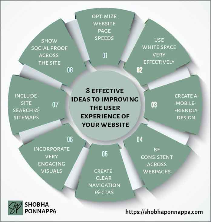
Leveraging my 40+ years’ experience as a Brand Content Strategist with a penchant for the unusual, I’ve crafted eight ideas that blend time-tested approaches with creative twists to vastly improve your website’s user experience.
These ideas merge conventional wisdom in web design with innovative, unexpected elements, each uniquely designed to engage users more deeply. This fusion not only enhances functionality but also ensures your website offers a memorable, distinct experience, setting your brand apart in a digital space where standing out is as crucial as fitting in.

Rapid page load times are crucial for enhancing user experience, directly impacting visitor engagement and retention. Imagine a user, Alex, who visits a website for gardening tips. If pages take too long to load, Alex’s frustration might lead to abandoning the site, no matter how exceptional the content is.
In contrast, a website that loads swiftly captures and retains visitor interest, encouraging deeper exploration of its offerings. This principle is vital in content marketing, where capturing and holding user attention is paramount.
Optimized page speeds ensure that your high-quality content is accessible without delay, fostering positive user interactions and reinforcing brand credibility.
By prioritizing page speed optimization, you not only improve user experience but also enhance the effectiveness of your content marketing strategy, ensuring that your valuable insights reach and engage your audience efficiently.

Consider the idea of “Dynamic Loading Delight.” This unusual enhancement involves incorporating engaging, interactive elements that load dynamically as the user scrolls through the site. For instance, in the hypothetical example of Alex visiting a gardening tips website, as he waits for content to load, instead of a typical loading icon, he could be presented with interactive, lightweight animations related to gardening, like growing plants or blooming flowers.
These elements, while being light on bandwidth, add an element of surprise and engagement, turning a typically mundane waiting time into a delightful and thematic experience, enhancing the overall user experience.
Masterfully utilizing white space can transform a website from cluttered to clear, directly enhancing user engagement and content absorption. Consider Sarah, who visits a website for financial advice.
The site’s thoughtful use of white space around text and between elements makes the content easily digestible, inviting her to spend more time exploring.
In content marketing, this technique is not just about aesthetics but also about making information accessible and appealing. By allowing content room to breathe, you reduce cognitive overload, making it easier for users to focus on and connect with your message.
This strategic use of white space thus becomes a subtle, yet powerful tool in enriching user experience and elevating the effectiveness of your content marketing efforts.

Consider the idea of “Interactive Space Canvas.” This unusual enhancement involves transforming the white space on your website into an interactive canvas that reacts to user actions. For instance, in Sarah’s case, visiting the financial advice website, the white space around text could subtly change color or texture as she scrolls or moves the cursor, providing a dynamic, engaging experience without distracting from the content.
This creative use of white space adds an element of interaction and surprise, enhancing the user’s engagement with the website, and making the journey through the content not just informative but also experientially delightful.
A mobile-friendly design is imperative for enhancing user experience, crucial in a world where a majority access the internet via smartphones. Picture John, who frequently browses on his phone.
When he visits a well-designed mobile-friendly site offering fitness advice, he finds the experience seamless. Text is legible without zooming, navigation is effortless, and the content loads quickly.
In content marketing, adapting to mobile-friendly designs means ensuring your content reaches and effectively engages the vast mobile audience.
It’s about providing a consistent, accessible, and enjoyable experience regardless of device, which in turn, fosters trust and loyalty towards your brand and amplifies the impact of your content strategy.

Consider the idea of “Gesture-Driven Interactivity.” This unusual enhancement involves integrating gesture-based controls for mobile users, offering an intuitive and immersive way to navigate and interact with the website. For instance, in John’s case, while browsing the fitness advice site, he could swipe, tap, or even shake his phone to access different sections or receive personalized workout tips.
This not only makes the mobile experience more engaging but also leverages smartphone capabilities to provide a unique, user-friendly way of exploring content, elevating the standard mobile-friendly design into a more interactive and personalized user journey.
Maintaining consistency across webpages is a fundamental aspect of user experience that fosters familiarity and trust. For Emily, who regularly visits a culinary website, the uniform layout, color scheme, and navigation across different pages make her experience intuitive and enjoyable.
This consistency in design and content structure plays a pivotal role in content marketing, where familiarity breeds comfort and reliability.
A consistent user interface ensures that the focus remains on the content, with users not having to relearn navigation or layout with each new page.
Such coherence not only enhances user satisfaction but also reinforces brand identity, making the website a dependable source for information and engagement.

Consider the idea of “Narrative Consistency Cues.” This unusual enhancement involves embedding subtle storytelling elements that evolve across pages, enriching the user’s journey.
For Emily’s culinary website experience, as she navigates from one recipe to the next, small changes in background elements or thematic illustrations could reflect the cuisine’s origin or history.
The idea is to offer a visual and educational thread that ties the pages together.
This method not only maintains visual and structural consistency but also weaves a compelling narrative through each page, enhancing engagement and enriching the overall experience.
Clear navigation and well-defined CTAs (Call to Actions) are crucial for guiding visitors through a website seamlessly and effectively prompting them to take action.
Imagine Lisa, who visits a health and wellness site seeking nutrition advice. Intuitive navigation helps her effortlessly find relevant sections, while compelling CTAs like “Get Personalized Diet Plan” encourage her to engage further.
In content marketing, this clarity in navigation and CTAs is essential for converting visitors into leads or customers.
It not only enhances the user journey but also aligns with the strategic goals of the site, ensuring users find value and take desired actions, which is vital for any content-driven website.

Consider the idea of “Contextual Animation in Navigation.” This enhancement involves integrating subtle animations into navigation elements and CTAs that respond to user interactions. For Lisa’s experience on the health and wellness site, as she hovers over different menu items, they could animate to display small, related graphics, like fruits for a nutrition section.
Similarly, CTAs could animate to emphasize the action, such as a button that gently pulses to draw attention. These animated cues add an engaging layer to the navigation, making the user’s journey not just clear but also visually and interactively delightful.
Engaging visuals play a pivotal role in enhancing user experience, making complex information easily digestible and appealing. Take, for instance, Michael, exploring a website about renewable energy.
Striking infographics, vivid images, and engaging videos make the complex topic accessible and interesting. In content marketing, visuals are not mere embellishments; they are powerful tools that drive engagement, simplify message delivery, and reinforce brand identity.
They break the monotony of text, provide a quick understanding of topics, and significantly increase the likelihood of content being read and shared.
This visual appeal is essential in today’s fast-paced digital world, where capturing and retaining user attention is critical for effective communication and brand positioning.

Consider the idea of “Cinematic Parallax Scrolling.” This enhancement involves creating a visual effect where background images move slower than foreground content during scrolling, giving a sense of depth. For Michael’s exploration of the renewable energy website, this could mean background images of wind turbines and solar panels subtly moving, creating an immersive, dynamic experience.
This technique not only makes the visuals more engaging but also tells a story as the user scrolls, enhancing the interactivity of the site without overloading it with heavy elements, and keeping the focus on the informative content.
Integrating site search and sitemaps is essential for enhancing user navigation and accessibility on a website. Imagine Karen, searching for specific gardening tips on a vast horticulture site.
A well-structured site search lets her quickly find relevant articles or products, while a comprehensive sitemap guides her through the site’s extensive array.
For content marketers, these tools are invaluable in helping visitors locate and engage with content efficiently, increasing the chances of conversion and customer retention.
A robust site search and clear sitemap not only improve user experience but also contribute to better SEO, making content more discoverable and the website more user-friendly.

Consider the idea of “Visual Search Mapping.” This enhancement involves integrating a visual representation of the sitemap, where users can visually navigate through a diagram-like structure of the website. For Karen, searching for gardening tips on a horticulture site, this could mean interacting with a visual map themed like a garden, where different sections are represented by various plants or gardening tools.
This not only makes the process of finding information more engaging but also provides a unique, intuitive way of exploring the site’s content, transforming the traditional sitemap into an interactive, visually appealing journey.
Measuring content performance is a crucial step in optimizing your content strategy’s effectiveness. Consider a tech gadget brand launching a series of product review videos.
By analyzing metrics such as view counts, audience engagement, and conversion rates, they can identify which videos resonate most with their audience. This data-driven approach allows them to refine their content strategy, focusing on the types of videos that deliver the best results. Content marketing isn’t a shot in the dark; it’s a precision game.
Measuring performance provides invaluable insights into what works and what doesn’t. It helps you allocate resources effectively, fine-tune your content, and achieve your marketing goals.
It’s akin to a navigational compass in the content marketing landscape, guiding you toward success by ensuring that every piece of content contributes to your brand’s growth and engagement.

Launch a “Performance Prediction Challenge.” Have your team predict the performance of upcoming content pieces before they’re published. Each team member can wager their predictions on various metrics like engagement, shares, or comments. This gamified approach not only infuses excitement but also taps into collective wisdom. Once the content goes live, compare the actual performance against predictions.
Those with the most accurate forecasts could earn incentives or recognition. It’s a unique way to harness your team’s insights, turning performance analysis into a collaborative and competitive endeavor. This unusual enhancement cultivates a culture of data-driven creativity, where your team’s intuition and analytical skills are put to the test, ultimately leading to more accurate content predictions and refined strategies.
Enhancing user experience through innovation and consistency: Balancing tried-and-true web design principles with creative, unconventional approaches is key to vastly improving the user experience on a website.
Effective use of visuals and navigation tools: Integrating engaging visuals and clear, user-friendly navigation options, including site search and sitemaps, is crucial for making websites more intuitive and accessible.
Personalization and interactivity: Incorporating unique elements like interactive visuals and dynamic site features can significantly elevate the user’s journey, making it not just informative but also engaging and memorable.

"As a Content/Brand Specialist, and SEO/UX Writer, I can help transform your brand's online presence. I can lift it with innovative ideas to take it to an enviable position. Let's collaborate to create a captivating brand story, engage your audience, boost your online visibility, and increase your ROI. Take the next step towards your brand content success and contact me today."
Shobha Ponnappa
I Bring You:
Content Marketing That’s “Unusual By Strategy” … Tips, Tricks, Tactics, Techniques, Trends, Training.
Get my weekly ContenTracker Newsletter packed with loads of content marketing ideas – proven and unusual.
Get a free download of my ebook on “50 Unusual Ways To Use AI In Content Marketing” … and transform your success.

Just fill in the form to join my community … we have big and small brands for company. You’ll stay on the speedway to growth.
KEY TOPIC CATEGORIES COVERED ON THIS SITE:
COPYRIGHT © 2024. SHOBHAPONNAPPA.COM. ALL RIGHTS RESERVED.

Just fill in this form and get this awesome ebook in your email inbox. Plus … each week you’ll receive my ContenTracker Newsletter that brings you tips, tricks, tactics, techniques, trends, and training on the latest in content marketing.