
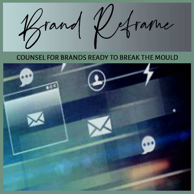
FOCUS: BRAND RELEVANCE LOSS | AUDIENCE: STEWARDS OF PLATEAUED BRANDS
BY: SHOBHA PONNAPPA | BRAND BREAKTHROUGH STRATEGIST | 45 YEARS | 125+ CLIENTS
I answer 6 tough questions about how legacy brand visuals … fonts, colours, layouts … can feel outdated and erode trust.
Many legacy brands pride themselves on longstanding recognition. But the same visuals that once offered assurance now feel tired in today’s faster, sleeker, more scroll-savvy world. Your old logo might still carry equity in boardrooms or product shelves … but online, it could quietly signal stagnation. In this post, I tackle six questions that show how digital-era relevance demands more than visual loyalty.
A good test is whether your visual identity blends into platforms instead of standing out. If your colours feel dull, your typography looks default, or your design grid mimics templates from a decade ago, your brand could be visually ghosting itself. Familiarity isn’t a free pass when freshness is the expectation. Younger audiences in particular judge a brand’s relevance in milliseconds.
Another clue: your visuals evoke nostalgia only for internal stakeholders … not for users. If your homepage, social tiles, or lead magnets look like archived brochures, they likely carry sentiment but not signal. Online, design is not about remembrance … it’s about resonance.
Absolutely … but consistency without evolution breeds invisibility. Visual memory matters, but it must be updated for current consumption habits. Fonts should read beautifully on screens, not just in print. Colours should pop without blinding. Icons and logos should scale seamlessly across formats. Consistency should be strategic, not nostalgic.
Many brands confuse asset preservation with brand coherence. It’s not about discarding identity; it’s about iterating for platforms where your audience now lives. Even slight modernisation can preserve equity while unlocking visibility.
Serif-heavy fonts that don’t translate well on mobile. Pale, pastel-heavy colour palettes that fade into white backgrounds. Logos with intricate detail that blur when scaled down. And layouts designed for reading left-to-right blocks, not swipe-friendly modular flows. Your digital interface has to fight for attention … not wait for it.
Also watch out for outdated metaphors … like using envelopes for email or discs for saving. Such symbols date your brand and suggest you’ve missed the pace of change. Digital relevance is not about tech trends, but cultural fluency.
Start by revisiting your brand essence … the emotional core that should guide visual evolution. Then redesign for screen readability, motion sensitivity, and platform-specific behaviours. A good rule? Keep 30% of your signature look, but rethink the rest for digital immersion. The goal is visual coherence, not creative cloning.
In several projects, I’ve helped legacy brands simplify their marks, brighten their palettes, introduce kinetic elements, or switch to variable fonts that look sharper on mobile. The trick isn’t to reinvent … it’s to reformat.
Yes … subconsciously and swiftly. When users see dated design, they assume dated thinking. Your message could be progressive, but if your visuals don’t reflect that, doubt creeps in. Bounce rates rise. Scroll stops. Visual mismatch is often the unseen saboteur of digital trust.
I’ve seen even brilliant service brands lose leads because their landing pages looked amateur. No amount of content clarity can offset the signal loss caused by design apathy. In digital branding, form is part of the function.
Resistance is natural … especially when visuals are tied to history or founders. But show stakeholders the difference between brand identity and brand equity. Identity is the symbol; equity is the meaning. One can evolve while the other is retained. Sometimes, it takes one A/B test to shift sentiment.
I often present mockups that show legacy visuals versus refreshed ones in live usage contexts … like Instagram carousels or mobile menus. When stakeholders see how small shifts lead to big impressions, their reluctance often turns to relief. Evolution doesn’t betray brand heritage … it extends it.
If these answers sound uncomfortably familiar, your visuals might be costing you credibility without you realising it. Legacy systems work until they don’t. A subtle design rethink can not only modernise perception, but also sharpen your strategy. It’s not about looking trendy … it’s about looking awake.
If you’re an investor seeking momentum for your portfolio brands, this FAQ Insight Post I wrote could interest you: “FAQs: Why Hiring Teams Too Soon Can Dilute Brand Voice.“
And if you’re a solo expert looking to sharpen traction, this FAQ Insight Post I worked on may resonate: “FAQs: When You’re Speaking on Panels … Yet Not Getting Clients.“

"One BIG IDEA can turn brand stagnation into unstoppable movement. Spots are limited each week ... book your breakthrough session now."
Shobha Ponnappa
More Breakthrough Ideas … Case Studies & FAQs … from the Brand Relevance Loss Category
Case Studies
FAQ Insights
I Bring You:
Smart insights, real-world frameworks, and idea-driven clarity – designed to help brands move.
Get my fortnightly Brand Reframe newsletter. Smart insights, distilled thinking, and focused momentum to help your brand lead.
Get my free case studies guide. Practical ideas, bold shifts, and clever transformations to propel your brand forward.
Just fill in the form to join. Get my newsletter and the guide shown alongside, all with several game-changing tips.
Just fill in this form and get this awesome guide via email. Plus … each fortnight you’ll receive my Brand Reframe Newsletter that brings you smart insights, distilled thinking, and focused brand momentum.