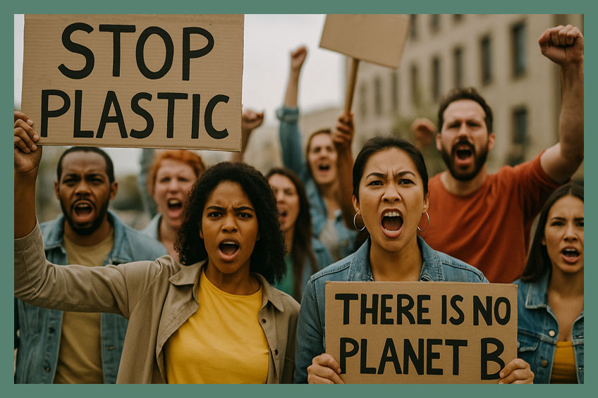
There are situations where purpose-driven activist brands broaden their appeal for commercial growth, yet lose their most passionate supporters when the original urgency and conviction of the movement becomes diluted. This often shows up as declining community loyalty, emotionally flat messaging, and audiences that recognise the brand aesthetically but no longer feel mobilised by it. The issue is rarely the desire to scale itself, but whether growth has weakened the sense of collective identity and action that once made the brand magnetic. This case study examines how an anti-plastic protest brand regained relevance and community energy by restoring activist intensity, protest-led storytelling, and movement-driven participation.
I helped an anti-plastic brand rediscover its protest power after going too generic on green and losing fandom.
This brand had once stood for something radical. It had emerged from the heart of an activist collective … its symbols drawn from protest posters, its slogans sharp, unapologetic, and raw. Its tote bags, T-shirts, and limited-run zines were worn not for fashion, but as a statement … a visible show of allegiance to the anti-plastic movement. In its early days, the brand didn’t chase margins. It sold purpose.
But somewhere along the way, the protest turned into productisation. In an effort to grow, the brand had hired a commercial creative team, onboarded influencers, and began styling its merchandise to suit calmer, more aesthetic feeds. Earth tones replaced urgency. “Eco-chic” took over from activism. The content became soft, vague, and lifestyle-oriented. The brand had retained visibility … but lost relevance to its core audience, who had once treated it as a battle flag.
The real audience for this brand wasn’t the eco-curious … it was the eco-committed. These were people who didn’t just want “good vibes”; they wanted clear calls to action. They didn’t want poetic captions about loving nature … they wanted words that rallied, provoked, and activated. To them, every diluted slogan was a betrayal. And every “sponsored” soft sell was a silencing of their collective voice.
I realised the brand had slipped from being a platform for expression to becoming just another muted marketplace. Its drift into palatability made it forget the one thing that had made it magnetic: it had once been an emotional rally point. It hadn’t just sold things … it gave people something to belong to. Rebuilding that meant restoring the brand’s ability to feel urgent, not just aware.
My breakthrough idea wasn’t just to resurface the anger … it was to create a two-speed structure: one that gave radical expression space to breathe again, and another that could sustain it commercially. I proposed a rotating campaign model where activist artists would co-create capsule collections … unapologetically themed around protest, data, and collective grief. This gave the core fandom something to stand behind again.
Simultaneously, the main product line could remain aesthetic … but would become clearly secondary to the campaign drops. Each capsule came with a purpose: tied to a petition, a clean-up event, or a live community action. The merchandise was not the message … it was the medium. By reframing the brand as a conduit of organised protest, not just eco sentiment, I gave it back its fire … without burning its bridges.
I relaunched the brand with a bold multi-phase structure. First, a “Reignite the Fight” teaser campaign that counted down to a public date of protest … this wasn’t an ad, it was a call. Then came the new product drops: one designed by an oceanic data scientist turned activist-illustrator, another by a South Asian zero-waste creator. Each campaign included exclusive gear, behind-the-scenes reels, and longform stories from the artists themselves.
I also opened up a digital space for community stories … where people could submit their anti-plastic battles, both wins and failures. This was about peer-to-peer fuel, not top-down messaging. Every caption, video, and product release was linked to a broader message: “We’re not here to soften the movement. We’re here to harden the resolve.” From tone to typography, everything became deliberate again.
Here are 10 strategic ideas developed (and several executed) to support the new brand direction:
Rotating Activist Capsule Drops: Monthly merchandise lines designed by guest creators tied to a clear cause or data point (e.g. microplastics in bloodstreams).
Live Protest Countdowns: Instagram Stories featuring 7-day countdowns to clean-up drives or digital activism events, linking back to each drop.
#NotNeutral Campaign Reels: Bold, minimal 15-second reels contrasting old vague slogans with fiery new statements … framed like flashcards.
Fan Submission Wall: A user-generated section of the website where supporters post photos wearing the merch at rallies, local drives, or beach clean-ups.
Artist Takeover Weeks: Activists and designers take over the brand’s Instagram and LinkedIn for one week per drop, narrating the campaign in their own voice.
Cause-Based Drop Archive: A permanent microsite showcasing all past capsule collections and the events or petitions they supported.
Digital Posters for Protesters: Free downloadable printables co-released with every campaign, usable for marches, walls, and school kits.
Podcast Snippets + Visual Quotes: 30-second soundbites from activist interviews shared as audiograms across platforms with campaign art as visual anchor.
Truth Ticker on Homepage: A dynamic ticker sharing real-time plastic pollution facts in harsh, simple language … reminding visitors why the brand exists.
Protest Prep Toolkits: Email series for subscribers that bundle activism guides, product drops, speech templates, and event invites in one place.
CONFIDENTIALITY CAVEAT: This case study represents a confidential engagement. For privacy, specific brand identifiers, campaign names, and project phases have been withheld. It has been shared with permission while preserving client discretion.

“I take up work for leaders and brands through a 5-Day Assignment designed to create movement quickly and precisely. How I work is outlined here.”
Shobha Ponnappa
Download the 14-case collection and receive weekly insights on leadership articulation and brand momentum.
Get my free Case Studies Compendium. See how breakthrough ideas drive C-Suite articulation and brand movement.
You’ll also get my weekly Breakthrough Thinking newsletter, where I examine real situations across leadership and brands, and defining shifts.
Just fill in the form to subscribe. Stay connected to how this thinking continues to evolve and unfold over time and across situations.